
It's been a year like no other in history. The world came to a screaching halt as a deadly virus spread city to city, country to country at an alarming rate. A global pandemic changed the world we once knew. It shut down entire school systems. Businesses were mandated to close. Millions of jobs were lost as social distancing forced us into isolation.
But we are nothing if not resilient.
As we locked our front doors and sought refuge in the security of our own homes, we did what we could to remain connected – we turned to the Internet.
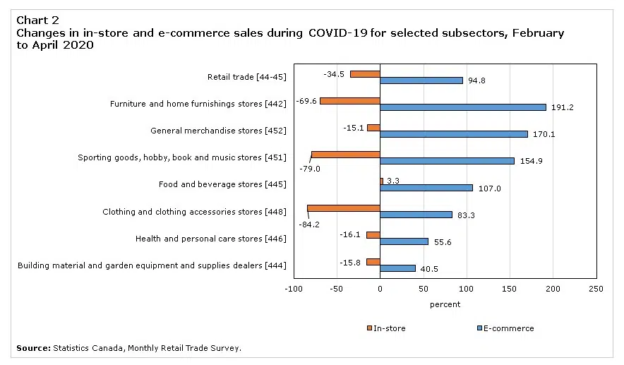
Retail e-commerce sales reach all-time highs
As storefront retail sales plummeted, e-commerce retail sales nearly doubled from February to May.
According to a Stats Canada survey:
- E-commerce saw a 63.8% monthly increase in April while in-store sales dropped 25.3%
- The COVID-19 impact peaked in April. Retail e-commerce sales spiked from 3.8% in April 2019 to a record high of 11.4% in April 2020
- Shopify reported a 62% increase in new stores created from March 13, 2020 to April 24, 2020, compared with the previous six weeks
As the retail landscape continues to evolve, we’ll see a growing influx of mobile web users.
Is your website mobile ready? Google has a free mobile-friendly test you can use to check it out.
Did you know …
- Google eliminates your site from mobile SERPs if it is not mobile friendly
- 71% of mobile searchers expect mobile site pages to load as fast or faster than desktop (Hubspot)
- Google reports that 40% of mobile consumers turned to a competitor’s website after an unsatisfactory mobile experience
- Two out of three shoppers prefer accessing a mobile website over a mobile application (Kissmetrics)
- One third of all e-commerce purchases were made on a smartphone during the holiday shopping season (Techcrunch)
How prepared is your business for this new norm? If you’re just starting out with mobile SEO, don’t sweat it, you’re not alone. Use the following checklist to quickly get on board the mobile-friendly train.
But first, some basics.
What is Mobile SEO?
Just like traditional Search Engine Optimization (SEO), Mobile SEO is the process of a) making your website user-friendly (working properly and looking great) on mobile devices, and b) optimizing your site so it shows up in mobile SERPs for relevant keyword queries.
According to Google’s Webmaster Central Blog, “By March 2021, all sites should be indexed mobile-first,” which means that, for the first time ever, Google will use the quality of the mobile version of your site to determine rankings – not the desktop version.
Google has already started making the switch to mobile-first indexing, so you don’t want to wait.
5 ways to ensure your website is mobile-ready
Responsive Design
A responsive site automatically changes its appearance to fit any screen size on any device. Building a flexible layout is fairly quick and simple from a development standpoint, but there are other options available.
It requires a little extra dev time, but some SMBs choose to use dynamic serving, which allows for a unique user experience for each device. Others choose to build an entire mobile app, which adds another layer of functionality that just isn’t possible on a mobile-friendly website.
We’re not opposed to building mobile apps—in fact, we think it’s a great way to build your brand. However, we do recommend building a responsive website to go along with the app … especially with Google’s mobile-first ranking quickly approaching.
Structured Data
These tiny bits of code help Google understand the content on your site. The easier it is for Google to understand what your website is about, the easier it is for them to rank your site properly for relevant user queries (aka: keywords).
According to Google’s Webmaster Central Blog, if you use structured data on the desktop versions of your site, you should use the same structured data on your mobile site.
“This is important because with mobile-first indexing, we'll only use the mobile version of your page for indexing, and will otherwise miss the structured data.”
Page Speed
Everyone is in a hurry. A slow-loading site is a poor-ranking site in Google SERPs. Worse, if your site doesn’t load quickly, users will move on to another site. Likely your competitor.
To improve page load speed, reduce file size with GZIP, optimize CSS and minimize the number of redirects. If you’re unsure about your page load speed, use Google’s free Pagespeed Insights.
Neil Patel also has an in-depth article about how to get your page load score to 100%.
No Flash
Most mobile devices don’t support Flash. That’s because it eats up batter power, it doesn’t work on Apple devices, and many users block Flash websites because of significant security concerns.
Instead, opt for JavaScript, CSS and simple image files.
User Experience
We saved the best for last. Providing a stellar user experience (UX) is critical when it comes to how your site will rank in the SERPs.
Think about how people are using mobile devices – thumbs clicking on small screens. It’s far more difficult to navigate a touch screen mobile device than it is to use a mouse on a full-sized screen.
Use large buttons and lots of white space for easy navigation. Use larger font sizes (14px for mobile; 11 points for iOS) for simple readability. Here’s a helpful article from Google: What Makes a Good Mobile Site.
Need help putting these 5 tips into practice? Talk to us—we’ll make sure your website is mobile friendly and ready to rock well in advance of Google’s March 2021 mobile-first deadline.